Six common wedding colour and style mistakes
Here are the six common wedding colour and styling mistakes for you to know & avoid 🙂
1. Ignoring your venue colours and architectural design
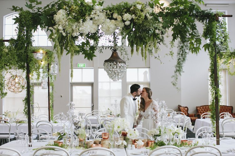
If you are doing a big styling job that would transform your venue into another look and have it aligned with your theme and colours, then in that case your venue follows your style. However, if little styling is to be done to the venue, you would need to ensure that your colour choice and texture matches with the venue colours and architectural design.
2. Forget to do colour sampling and get straight into creating, purchasing things of selected colours
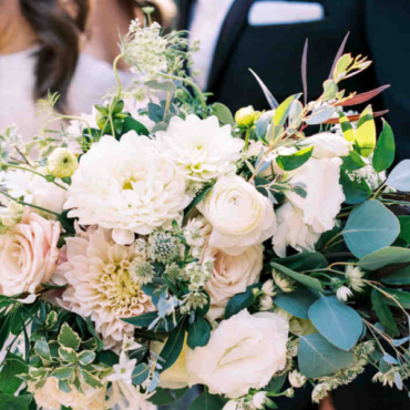
Some brides-to-be actually order (fresh) sample bouquets to see if the colour mix works but that is perhaps not necessarily, especially if you are planning with experts. If planning with experts, your florist, stylist or planner should be able to give you advice regarding your colour palette, flower choice & availability. As floristry is at the mercy of the nature and what’s available each season can vary by a few weeks each year, I also often advise brides-to-be to select a colour palette instead of specific flowers and it is our job to match the brides colour, flower choice and design as best as possible. For DIY planning, the easiest way to see if certain colours go together (before creating or purchasing anything) is to google or search Pinterest or look through some stylists work portfolios for sample images of the colour mix that you are after, then combine that with other people’s advice and opinions. Without being a colour expert, the pictures should tell you if those favourite colours of yours mix well or if they are pleasant to the eyes or not. If you are planning your colour theme with an expert (florist, planner or stylist), then they should be providing you with their advice and the design brief proposal including your colour theme. In this case, be specific about your colour choice when describing them to your experts – for example: instead of green, say if its emerald green, lime green or sage green.
3. Ignoring texture
Two colours that go together may not look right when put side by side if they’re different textures while contrasting textures in combo do work very well in other cases! This is indeed a difficult one to describe as there are so many different combinations out there and even stylists still have to play around with the different tones and textures to find what works, what doesn’t. For DIY styling, I wouldn’t advise anyone to invent new texture or look – of course you can if you’d like but it would just be very time consuming and it may not work. There are tones of images available online and so just look at what has already been created while having this note about texture in mind.
4. Using too many colours
With a few exceptions, you should pick two to four colours that go well altogether and stick to them. Using the same colors throughout your wedding décor will help create a cohesive flow, so every detail looks like it belongs. Narrowing your palette to a few colors will also keep elements like your centerpieces from looking too messy. You can opt for a few slightly varied shades of the same color. This will add depth without looking too chaotic. Or, for an especially striking style, go monochromatic with a bold shade, or attempt the mix of two strong and contrasting colours with some other tones – for example: ruby red and deep purple with a tint of blue and green – be extra careful with the later. The idea is to keep the look tailored for maximum impact.
5. Limiting Yourself to Only Two Distinct Colours
Break the above rule wisely. While not having too many, especially contrasting colours in the mix, you don’t have to stay restricted to the two distinctive colour rule. Many gorgeous weddings have a variety of colours—sometimes up to five—that work together. The way to pull it off is to use more than one neutral, like cream and brown, in your colour palette, or go for multiple shades of the same hue to create a tonal scheme.
6. Choosing Predictable Colours
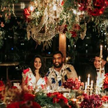
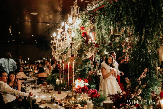
Certain colours come with obvious connotations – for example: red and green remind you of Christmas – you wouldn’t want your wedding looking Christmassy. If red and green happen to be your favourite colours, you would need to be ready to take (a little) risk and be creative to deviate from the expected look. Change/add another tone or another neutral colour to the mix to downplay or vary the combo. For example, change the red to a burgundy or ruby red colour, add rustic gold decor, crystal chandeliers and lighting into the mix. The post image above is an example of red and green being mixed extremely well with other decor and lighting effects – done by one of our leading stylists.


